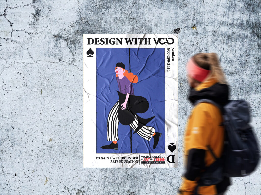
Created with the purpose of expressing Visual College of Art and Design’s core values, these cards present a narrative of growth: starting from gaining a solid foundation in design, moving to a space where individuality is celebrated, and ultimately launching into a future where creative ideas inspire others.
Bold, flat colors and stylized illustrations offer a modern, engaging aesthetic that speaks to young, aspiring artists. The strong visual aesthetic paired with these themes creates a compelling argument for VCAD as a place where students are empowered to bring their visions to life and succeed in their creative pursuits.
Each poster, using iconic playing card motifs, not only symbolizes the versatility and adaptability that VCAD students cultivate throughout their education but also draws on a connection between chance and intention—much like the journey of an artist where passion, skill, and opportunity intersect.
VCAD
CAMPAIGN
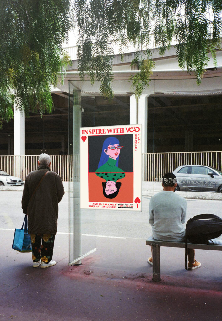
The red heart suit, traditionally associated with passion and emotion, showcases how VCAD students are equipped to take their skills and ideas into the world to inspire others.
The card highlights the transformative journey one undergoes, from their early aspirations to their fully realized, confident and educated self, overcome with newfound clarity, vision and the motivation to take on the world.
The spade suit, often symbolizing wisdom, intellect, and hard work aligns with the idea of students gaining a well-rounded arts education at VCAD.
The design showcases how the program empowers students to take charge of their creative journey with a solid foundation in design knowledge, boldly breaking from the traditional mold and stepping into their artistic future.
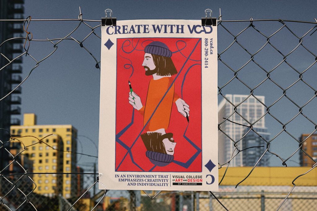
The diamond suit is associated with creativity, wealth, and craftsmanship, perfectly mirroring the environment at VCAD that encourages creativity and individuality.
The dual nature of creativity is visually communicated—both internal reflection and external expression, where technical skill meets artistic vision, and personal growth aligns with professional ambition. The illustration suggests that students are encouraged to bring their ideas to life in their own way, using the tools and mentorship provided by the college.
Wildsight Branding
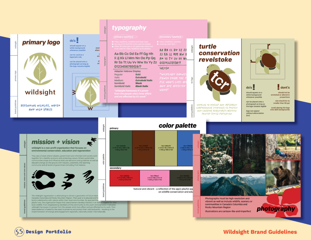
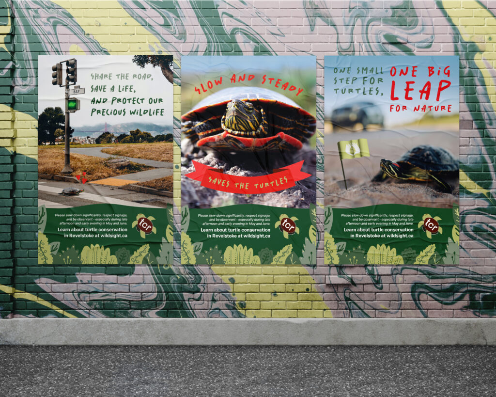
Wildsight is a non-profit organization that focuses on environmental conservation, education and regeneration. They see a future where industry, government and informed civil society work together for a healthy economy and protecting nature. Where sustainable communities shape and influence land-use decisions and guidelines as well as steward change on the ground with industry, scientists, the teaching community and all levels of government including First Nations.
No matter the platform, wildsight aims to speak on behalf of nature and help viewers/users develop a connection with the biodiversity that surrounds them. Through education, wildsight strives to inspire a conservation ethic in children and communities so that future leaders of tomorrow will be equipped to deal with the challenges of sustainability.
Even while dealing with very important issues, such as working to develop and implement comprehensive strategies to protect and conserve Revelstoke’s Western Painted Turtle population, their tone should remain upbeat and supportive. With the goal being to inspire change, users must first be motivated then educated. In order to spark action, wildsight and the TCR should always uplift it’s audience and create a sense of belonging for those who are passionate and curious about nature conservation.
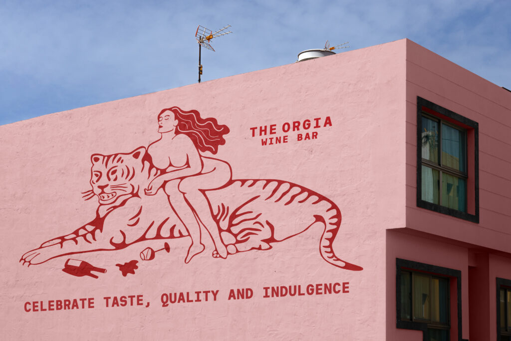
THE ORGIA REBRAND
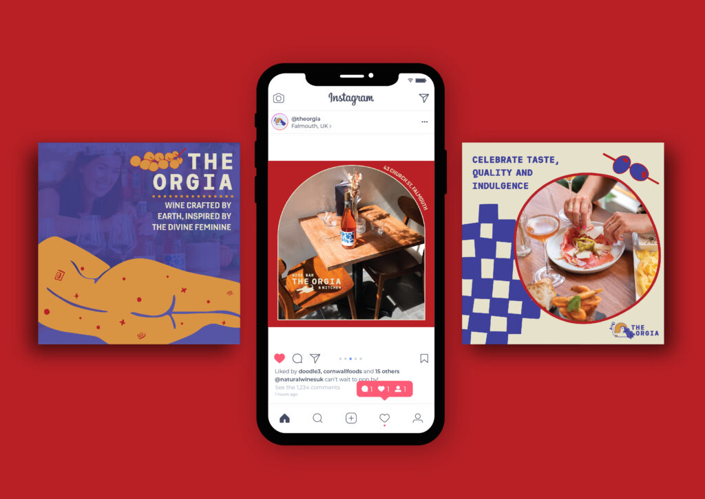
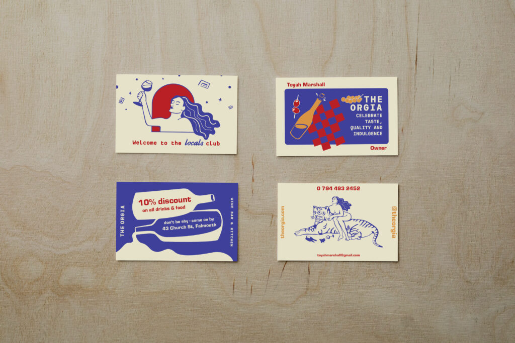
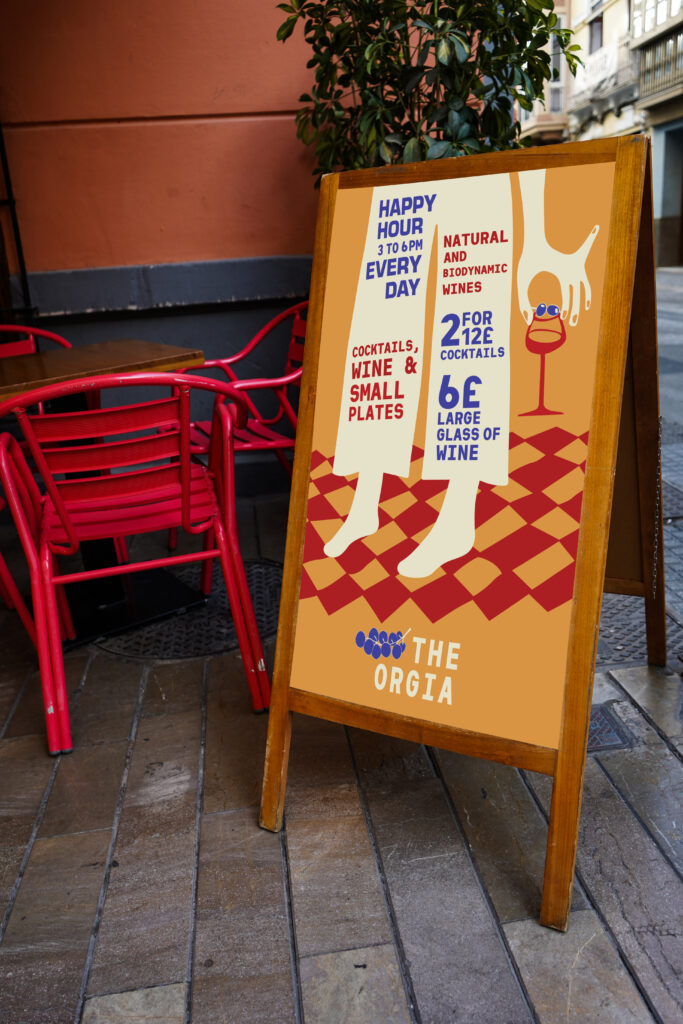
Based on Greek religion, The Orgia is a form of worship and celebration, often featuring dancing and wine – in essence the epitome of ecstasy. With a focus on the alchemy of sustainable skin contact, natural and biodynamic wines, there is so much magic and passion involved, that it almost seems like witchcraft.
Showcasing wines and food that are provided sustainably without sacrifice, the Orgia believes that both quality and sustainability are of high importance. The wine bar and kitchen aims to remove the snobbery out of wine, creating a quaint space where consumers from all walks of life can gather, learn and share a passion for skin contact wine, meticulously curated for their authenticity and flavour. Reflective of the magic and indulgence involved with drinking natural wines, the Orgia invites a sense of sensuality and liberation to their establishment– for consumers to have fun and forget their worries.
The tone for the brand going forward will continue to remain focused on the natural aspect of wine making and a respect for mother earth. However, it will be visually represented in a more approachable way – with a look that is less formal and refined. Instead taking on a more artsy, authentic and unfiltered appearance (much like its wine).
